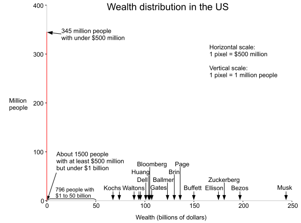
Forbes recently published the Forbes 400 List for 2024, listing the 400 richest people in the United States. This inspired me to make a histogram to show the distribution of wealth in the United States. It turns out that if you put Elon Musk on the graph, almost the entire US population is crammed into a vertical bar, one pixel wide. Each pixel is $500 million wide, illustrating that $500 million essentially rounds to zero from the perspective of the wealthiest Americans.

The histogram above shows the wealth distribution in red. Note that the visible red line is one pixel wide at the left and disappears everywhere else—this is the important point: essentially the entire US population is in that first bar. The graph is drawn with the scale of 1 pixel = $500 million in the X axis, and 1 pixel = 1 million people in the Y axis. Away from the origin, the red line is invisible—a tiny fraction of a pixel tall since so few people have more than 500 million dollars.
Since the median US household wealth is about $190,000, half the population would be crammed into a microscopic red line 1/2500 of a pixel wide using the scale above. (The line would be much narrower than the wavelength of light so it would be literally invisible). The very rich are so rich that you could take someone with a thousand times the median amount of money, and they would still have almost nothing compared to the richest Americans. If you increased their money by a factor of a thousand yet again, you'd be at Bezos' level, but still well short of Elon Musk.
Another way to visualize the extreme distribution of wealth in the US is to imagine everyone in the US standing up while someone counts off millions of dollars, once per second. When your net worth is reached, you sit down. At the first count of $1 million, most people sit down, with 22 million people left standing. As the count continues—$2 million, $3 million, $4 million—more people sit down. After 6 seconds, everyone except the "1%" has taken their seat. As the counting approaches the 17-minute mark, only billionaires are left standing, but there are still days of counting ahead. Bill Gates sits down after a bit over one day, leaving 8 people, but the process is nowhere near the end. After about two days and 20 hours of counting, Elon Musk finally sits down.
Sources
The main source of data is the Forbes 400 List for 2024. Forbes claims there are 813 billionaires in the US here. Median wealth data is from the Federal Reserve; note that it is from 2022 and household rather than personal. The current US population estimate is from Worldometer. I estimated wealth above $500 million, extrapolating from 2019 data.
I made a similar graph in 2013; you can see my post here for comparison.
Disclaimers: Wealth data has a lot of sources of error including people vs households, what gets counted, and changing time periods, but I've tried to make this graph as accurate as possible. I'm not making any prescriptive judgements here, just presenting the data. Obviously, if you want to see the details of the curve, a logarithmic scale makes more sense, but I want to show the "true" shape of the curve. I should also mention that wealth and income are very different things; this post looks strictly at wealth.